Timeline
Create an attractive Vertical Layout to showcase your blog posts in a tiled manner using the EAE - Timeline Widget. You can use the timeline widget to display the content from the post or to display some custom events.
Content
Skins
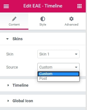
Skin: Select from the different layout styles of the cards to display the Content in Timeline.
Source: Select from Custom or Post. Custom lets you to manually enter data of specific event. Where as Post allows to pick content dynamically from the blogs and custom post types.
Custom Timeline
When selecting Custom option in Source.
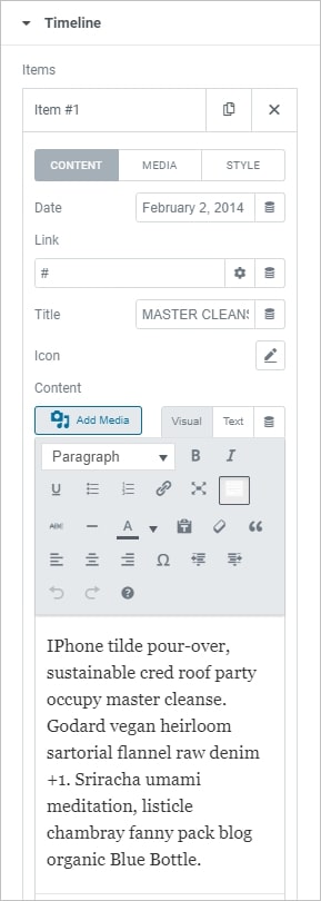
Timeline Click on the ADD Item button to add an event to the Timeline.
Items: Add the items individually here.
Date: Add information about the date or the timing of the event.
Link: Set the URL for the button’s link. Set the link to either open in a new window or to add nofollow to the link.
Title: Give suitable tittle to be displayed in the Card
Icon: Set an icon for each card in timeline.
Type: Select the icon type like Custom Icon, Font Awesome icon, or text- select if you want to use the icon or the text to point as an icon for the Timeline card.
Content: Provide more information about the event card in the timeline.
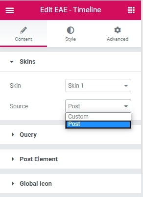
Post Timeline
When selecting Post option in Source, you get two more options Query and Post Element.
Query
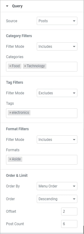
- Source: Select from where the content will be retrieved and displayed. Options include Post, page, or Custom Post Types.
Category Filter
- Filter Mode: Include and exclude Categories accordingly.
- Categories: Select the name of the Category to be included or excluded. Multiple categories can be selected.
Tag Filters
- Filter Mode: Include and exclude Tags accordingly.
- Tags: Select the name of the tags to be included or excluded.
Format Filter
- Filter Mode: Enable to apply format filters.
Order & Limit:
- Order By: Set the order in which the posts will be displayed. Options include: Date, Title, Menu Order, or Random
- Order: DESC (descending) or ASC (ascending)
- Offest: Use this setting to skip over posts
- PostCount: Sets the exact amount of posts displayed
Post Element
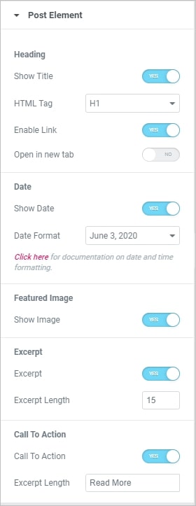 Heading
- Show Title: Enable to display the title of posts in the Timeline cards Html Tag: Select the HTML tag to use for the title, from H1 to H6, or div, span, or p.
- Enable Link: Enble it to make the card clickable.
- Open in New Tab: Choose Yes to open posts in a new tab.
Date
- Show Date: Displays the post publishing date.
- Date Format: Select the format to display date.
Featured Image
- Show Image:: Enable to display the feature image of the post in timeline.
Excerpt
- Excerpt: Choose to show or hide the excerpt.
- Excerpt Length: Choose the length of the excerpt, setting the exact amount of words displayed.
Call To Action
- Call To Action: Show or hide the Read More button.
- Text: Customize the Read More text.
Gobal Icon
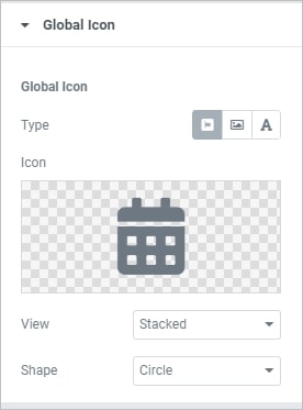
Give a default icon to all the timeline cards.
- Type: Choose the icon type like FontAwesome icon, image or text to display.
- Icon: Select an icon from the FontAwesome library .
- View: Choose the default icon view, or select Stacked or Framed.
- Shape: If Stacked or Framed is chosen, choose Circle or Square.
Style
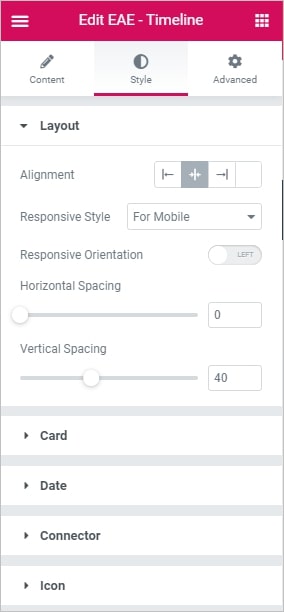
Layout
- Alignment: Arrange the cards to the left, center, and right alignment types.
- Responsive Style: Make the Timeline layout responsive for Mobile and for Tablet
- Responsive Orientation: Set the Alignment for the responsive style like Left or Right
- Horizontal Spacing: Set the horizontal spacing of the card’s
- Vertical Spacing: Set the vertical spacing of the card’s
Card
- Alignment: Align the content inside the card to Left, Center, and Right
- Padding: Set the padding of the card’s content
- Alignment: Align the image inside the card to Left, Center, and Right.
- Alternate Style: Enable it to display the cards in the alternate style
- Size: Set the size of the image
- Spacing: Adjust space between the content block and the image.
- Radius: Set the roundness of the edges of the images
- Arrow Alignment: Define the alignment of the card arrows.
- Title Color: Specify the color of the title for Normal, Hover and Active States
- Content color: Choose the color of the content for Normal, Hover and Active States
- Title Typography: Set the typography options for the Title
- Content Typography: Set the typography options for the Content
- Title Shadow: Add a shadow and blur to the title text
- Content Shadow: Add a shadow and blur to the content
- Background Color: Choose the background color of the timeline card Normal, Hover and Active States
- Border Radius: Set the roundness of the border corners of the timeline cards
- BoxShadow: Set the box-shadow options around the cards
Date
- Padding: Set the padding of the Date text
- Margin: Set the margin
- Color: Specify date color
- Text Shadow: Add a shadow and blur to the Date text
- Typography: Set the typography options for the Date
Connector
- Color: Customize the color to apply for the connector
- Progress Color: Set the preferable color to be shown when the progress moves on.
- Thickness: Specify the width of the timeline line.
Icon
- Primary Color: Choose the primary color of the icon
- Secondary Color: Choose the secondary color of the icon
- Icon Size: Set the size of the icon
- Padding: Set the amount of padding around the icon
- Rotate: Select the number of degrees to rotate the icon, from 0 to 360.
- Border Style: Select the type of border, choosing from none, solid, double, dotted, dashed, or grooved
- Border Width: Set the width of the icon border
- Border Radius: Set the radius of the icon border to control corner roundness