Thumbnail Slider
Add interactive sliders to your Elementor Website, with lots of functionalities and advanced features. Add and customize the thumbnail slides and images.
Content
Slides
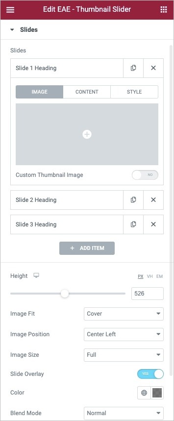
- Slides: By default, you will get three tabs to create slides for your slider. If you want to add more slides, click on the Add Item button.
- Image: Add an image to the slider. If you want to customize the thumbnail image, click on the Custom thumbnail option.
- Content: Add custom content to the slides.
- Style: Under the style option, you can give a specific styling to that particular slide.
- Height: Set the height of the carousel.
- Image Fit: Select how the image fits into its container, either Cover, Contain, or Auto.
- Image Position: Set the image position within the slider like center, center right, top right, and there are many other options to choose from.
- Image Size: Select size of the image, from Thumbnail to Full, or Custom.
- Slide OverLay: Enable it to add an overlay effect to the slides.
- Color: Choose the overlay color.
- Blend: Select the blend mode type like normal, multiply, blend, overlay, etc.
Thumbnails
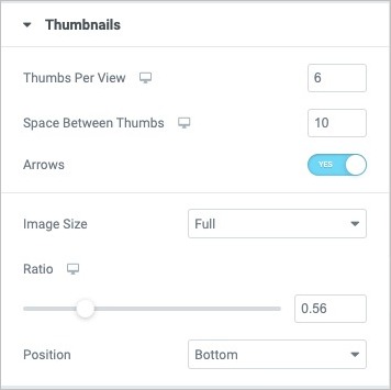
- Thumbs Per View: Enter the number of image thumbnails to view. By default, three thumbs are displayed.
- Space Between Thumbs: Adjust the spacing between the thumbnails.
- Arrow: Enable this option to add navigational arrows to the thumbnail slider.
- Image Size: Set the image size within the thumbnails.
- Ratio: Set the image aspect ratio.
- Position: Set image positioning bottom or top.
Slider Options
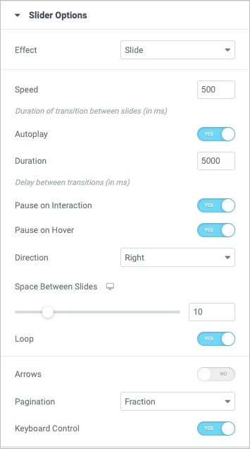
- Effect: Choose how each slide transitions, either Slide, Fade.
- Speed: Set the time between each slide. This time is in milliseconds, so 1000 ms is equal to 1 second.
- Autoplay: Show or hide autoplay.
- Duration: Set the time it takes for each slide to appear.
- Pause On Interaction: Select whether or not to pause autoplay when a user interacts with the carousel.
- Pause On Hover: Select whether or not to pause autoplay when a user hovers on the carousel.
- Direction: Set slider direction from the left or right.
- Space Between Slides: Set the space between slides
- Loops: Show carousel in a continuous loop, infinitely.
- Arrow: Choose to show or hide the navigation arrows
- Icon Prev: Add the previous icon.
- Icon next: Add the next icon.
- Pagination: Select None, Dots, Fraction, or Progress.
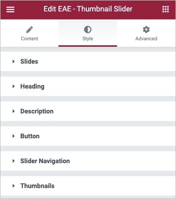
Style
Slides
- Space Between: Set the space between slides and thumbnails
- Border Type: Select the type of border to use around the slides, select from none, solid, dotted, dashed, and groove.
- Border Radius: Set the border-radius to control corner roundness
- Padding: Set the padding.
- Horizontal Position: Set the horizontal positioning of the text within the slides.
- Vertical Position: Set the vertical positioning of the text within the slides.
- Text Align: Align the text on the slides to the left, center, or right.
- Text Shadow: Apply shadow on the text.
- Content Width: Set the width of the text content in the slide
- Content Background Color: Choose a background color for the text content.
- Content Padding: Set the content padding accordingly.
Heading
- Text Color: Choose an appropriate color for the heading text.
- Typography: Set the typography options for the heading text.
- Spacing: Adjust the spacing between the heading text and description.
Description
- Text Color: Choose an appropriate color for the text.
- Typography: Set the typography options for the text in the description.
- Spacing: Adjust the spacing between the description and the button.
Button
- Typography: Set the typography options for the button text.
- Text Color: Choose color for the text.
- Background Color: Choose button's background color.
- Border Type: To give border around the button, choose the border type from none, solid, dotted, dashed, and groove.
- Width: Set the border width
Slider Navigation
- Color: Choose color for the navigational text.
- Active Color: Set color for the slide navigation on active.
- Size:Adjust the size of the navigation text.
Thumbnails
- Border Type: Select the type of border to use around the thumbnails
- Border Radius: Set the border-radius to control corner roundness.
- Arrow:
- Color: Choose color for the navigational arrows
- Size: Set the arrow size.