Data Table
EAE - Data Table widget lets you create well-structured Data Tables for your WordPress site. It gives you more flexibility and ease in table designing and comes with lots of customization options.
Content
Header
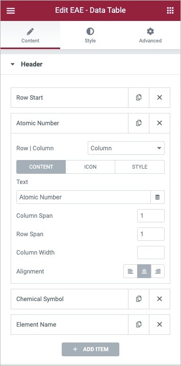
Here you can create a table header section. Every time you add a new row that section is by default marked as 'Row Start'. To add the header content click on the Add Item button.
- Row/Column: Select Column to add the content inside the cell. Each item in the cell has three control tabs
- Content:
- Text: Enter the text for the header row.
- Column Span: Enter the number of columns you want to merge.
- Row Span: Enter the number of rows you want to merge.
- Alignment: Set the text's alignment in the cell, left, center, or right.
- Icon: Here you can add custom icons inside the header.
- Style: Here you can give custom styling to each individual item separately.
Body
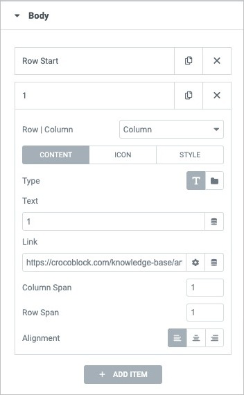
Here you can add content to your table. Here you will get a default Row section every time you add a new row named "Row Start." You can add a new Row by clicking on the Add Item button.
Each row consists of cells. To add cell to individual rows, click on the add item button. Each item has three tabs.
- Content
- Type: Choose whether to add content manually or import a Template.
- Text: Enter the text in the cell
- Link: Add a URL on the text to navigate on the other page.
- Column Span: Enter the number of columns you want to merge.
- Row Span: Enter the number of rows you want to merge.
- Alignment: Set the text's alignment in the cell, left, center, or right.
- Icon Here you can add custom icons inside the cell.
- Style Here you can give custom styling to each individual item separately.
Table Settings
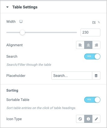
- Width: Adjust the Width of the table.
- Alignment: Align the table to the Left, Right, or Center
- Search: Enable it to add a Search box to the table
- PalceHolder: Enter the placeholder text for the Search text box
Sorting
- Sortable Table: Enable it to make table data Sortable
- Icon Type: Add a Sort icon.
Style
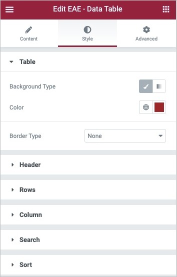
Table
- Background Type: Select solid Color or gradient as a background type.
- Border Type: Select the border type, from none, solid, double, dotted, dashed, or grooved
Header
- Typography: Change the typography options for the header text
- Color: Choose a color for the text in the header row.
- Background Color: Choose a background color for the header.
- Icon Color: Set the icon color
- Border Type: Set the border style around the headers.
- Width: Set the border width
- Color: Choose the header border color.
- Padding: Adjust the Padding.
Rows
- Typography: Set the typography option for the row content
- Striped Rows: Enable to apply Even Odd background Style to the table rows.
- Border Type: Select the border type, from none, solid, double, dotted, dashed, or grooved
- Width: Set the border thickness
- Color:Choose the border color.
- Padding: Set the Padding for the Rows.
Column
- Typography: Set the typography option for the text in Columns
- Color: Set Color for the Column text.
- Hover Color: Set Color for the Column text on Hover
- Background Color: Set the background color for the even and odd Columns.
- Hover Background Color: Set the background color for the even and odd Columns on hover state.
- Icon Color: Set the icon color on normal state
- Hover Icon Color: Set the icon color on the hover state.
Search
- Width: Set the Width of the search box
- Alignment: Set the Alignment of the box
- Bottom Spacing: Adjust the spacing between the search box and the table.
- Border Type: Select the border type, from none, solid, double, dotted, dashed, or grooved
- Typography: Set the typography option for the search text
- Color: Set Color for the text
- Background Color: Choose the background color for the search box.
- Position: Set the position of the Search icon as Before or After the placeholder text.
- Size: Set the icon size.
- Color: Choose color for the icon
Sort
- Color: Choose the Sort icon color
- Hover: Choose the sort icon color on the hover.
- Size: Set the Size of the icon