Chart
The Chart widget allows you to create amazing grahpical data charts in Elementor Page Builder. You can easily make animated charts and can customize them accordingly.
Content
Layout
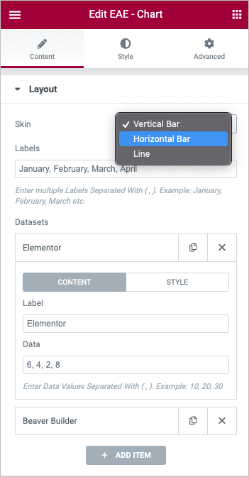
- Skin: Select one of the following chart layouts, Horizontal, Vertical, Line.
- Labels: Labels field allows you to give every set of bars a separate name. If there is more than one set, you have to separate the names with a ( , ).
- DataSets: Enter the items that the bars in the chart will represent. Click on ADD Item button to create more items.
Content:
- Label: Labels field allows you to give every set of data a separate name
- Data: Define the values for the label field. If there are mulitple data values enter the values separated by (,) to create charted data.
Style: Here in this tab, you can define the colors of the bar and its border in normal state and when the user hovers a pointer over the section.
Additional Settings
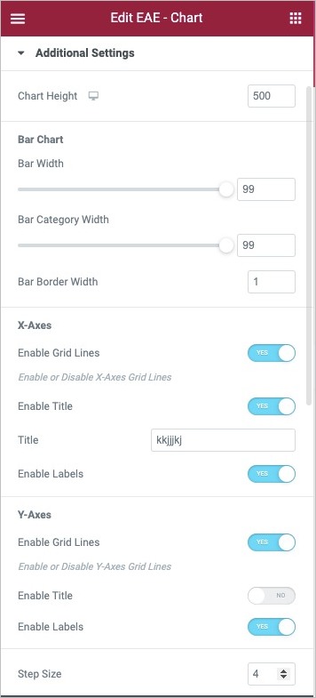
- Chart Height: Set the graph height in pixels
- Bar Width: Set the width of the bars in case of Horizonatl and Vertical Skin option. If you select Line chart option in the skin then you can set the width of the line also.
- Bar Category Width: Control the width of the bars in the charts.
- Bar Border Width: Set the border width.
Line Chart
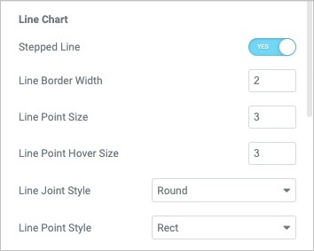
You will get some options when you select the Line in the layout skin.
- Stepped Line: Enable it to create the line chart in a stepped lined layout.
- Line Border Width: Set the border width of the lines
- Line Point Size: Set the point size
- Line Point Hover Size: Set the pointing size on hover
- Line Joint Style: Set the style for the joint intersection like Miter, Round and Bevel.
- Line Point Style: Set the Point style, select from the different options available.
X Axis:
- Enable Grid Line: Enable or Disable X-Axis Grid Lines
- Enable Title: Enable this option to add the text that will be shown as on the x-axis.
- Enable Label: Enable this option to display label on the x-axis.
Y Axis
- Enable Grid Line: Enable or Disable Y-Axis Grid Lines
- Enable Title: Enable this option to add the text that will be shown as on the y-axis.
- Enable Label: Enable this option to display label on the y-axis.
- Step Scale: Enter a number to define the size of the steps.
- Scale Axis Range: Set the maximum number of the scale according to your need.
Title
- Enable Title: Enable or disable the chart title
- Title: Enter the Chart Title
- Position: Set the position to display the title, Top or Bottom
Legend
- Enable Legend: Enable this option to help your readers to understand the charted data.
- Position: Select the legend position from the top, right, bottom, and left.
- Alignment: Set the alignment for the legend data to display
- Reverse: You can enable or disable the legend data reverse option.
Tooltip
- Enable Tooltip: Enable this option to add a tooltip for the chart data on hover.
- Mode: You can choose to display different values when hover. You can choose from Index or Point.
Animation
- Animation: Add the animation style to the chart. Select from the different options available.
- Animation Duration: Set animation duration
Style
General
- Background Type: Set the background style like solid color, image and gardient.
- Overlay: Enable the option to add an overlay effect to image background
- Border Type: Set the border type from none, solid, double, dotted, dashed, or grooved.
- Border Radius: Control the corner roundness of the border
- Margin: Set the margin parameters.
- Padding: Set the paddings.
X - Axis
Grid
- Color: Set the color for the grid lines on x-axis.
- Width: Set the width for the grid.
Title
- Color: Set the title color.
- Typography: Choose the typography settings for the title.
Lable
- Color: Set color for the label on x-axis
- Typography: Set typography parameters for the label text
- Padding: Set padding around the text
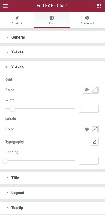
Y - Axis
Grid
- Color: Set the color for the grid lines on y-axis.
- Width: Set the width for the grid.
Title
- Color: Set the title color.
- Typography: Choose the typography settings for the title.
Lable
- Color: Set color for the label on y-axis.
- Typography: Set typography parameters for the label text.
- Padding: Set padding around the text.
Title
- Color: Set the color for the title of the Chart.
- Typography: Set the typography options for the Title text.
- Padding: Set the padding values for the title.
Legend
- Color: Set the color for the legend text.
- Typography: Set the typography options for the legend text.
- Padding: Set padding parameters for the legend.
Tooltip
- Background Color: Set the background color to display the tooltip text on hover.
- Border Color: Set the border color.
- Border Width: Set border width.
- Border Radius: Set border radius for the roundness of corners.
- Arrow Size: Set the tooltip arrow size.